Hello Ladies && Gents,
Some time ago there was a ton of hype over the launch of Maybelline’s the Nudes palette. (Which don’t get me wrong I was there with everyone else celebrating this drug store gem)
HOWEVER! There have been a few new additions to Maybelline’s Palette range && since I loved the first palette installment, I had to pick up the two newest products that have launched.
Today, I will be reviewing Maybelline’s the Brights palette.
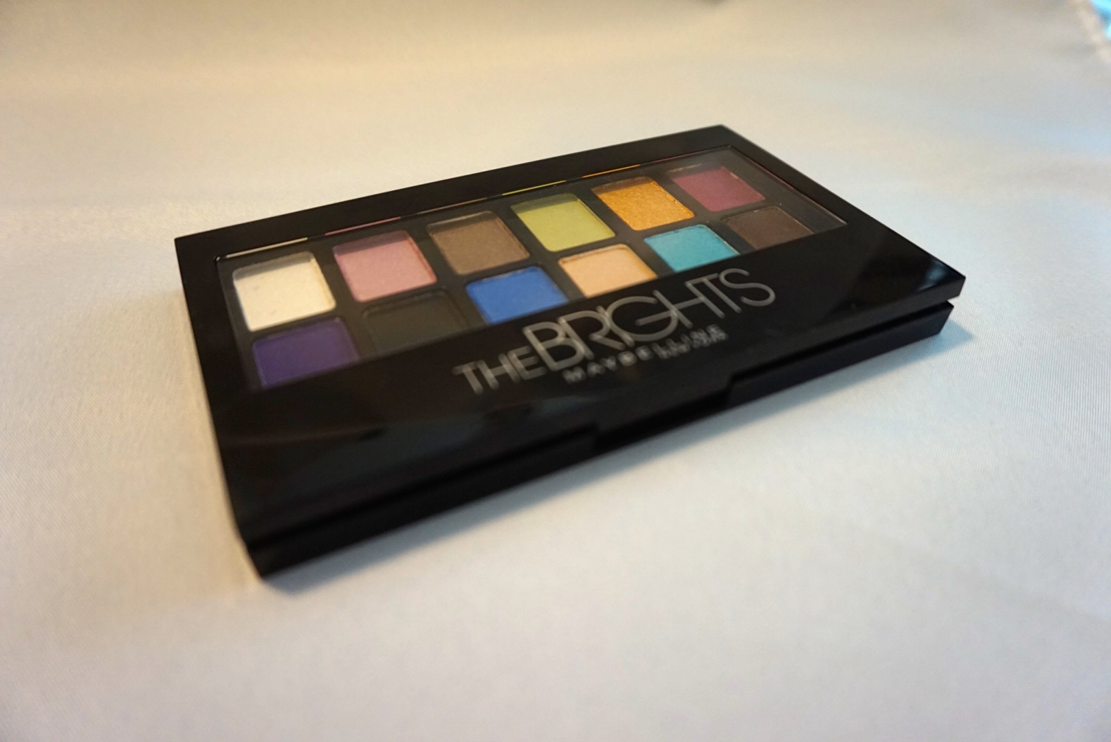
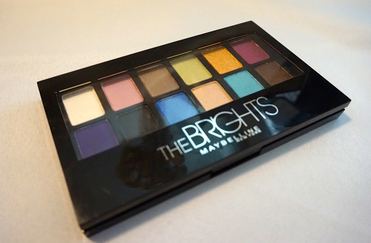
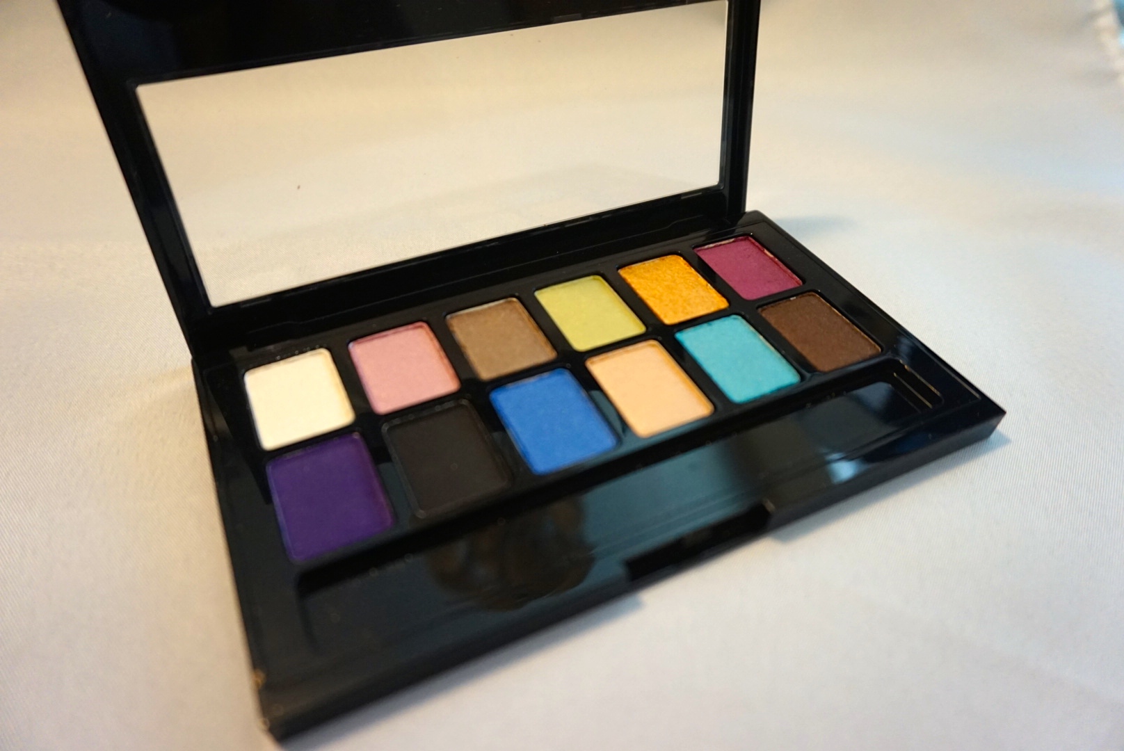
The Bright’s is set up exactly like it’s sister the Nudes. It comes with 12 Shadows (.34 oz each). && The packaging is the same sleek black design. The Palette also comes complete with a small brush applicator.
Now for the Shadows!
Over all these shadows are creamy, and easy to build. They do have some fall out however, so with these I do recommend tapping excess product off before application.
(There are no names printed on the Palette for the individual shadows , so I am just going to label them for today’s convince!)
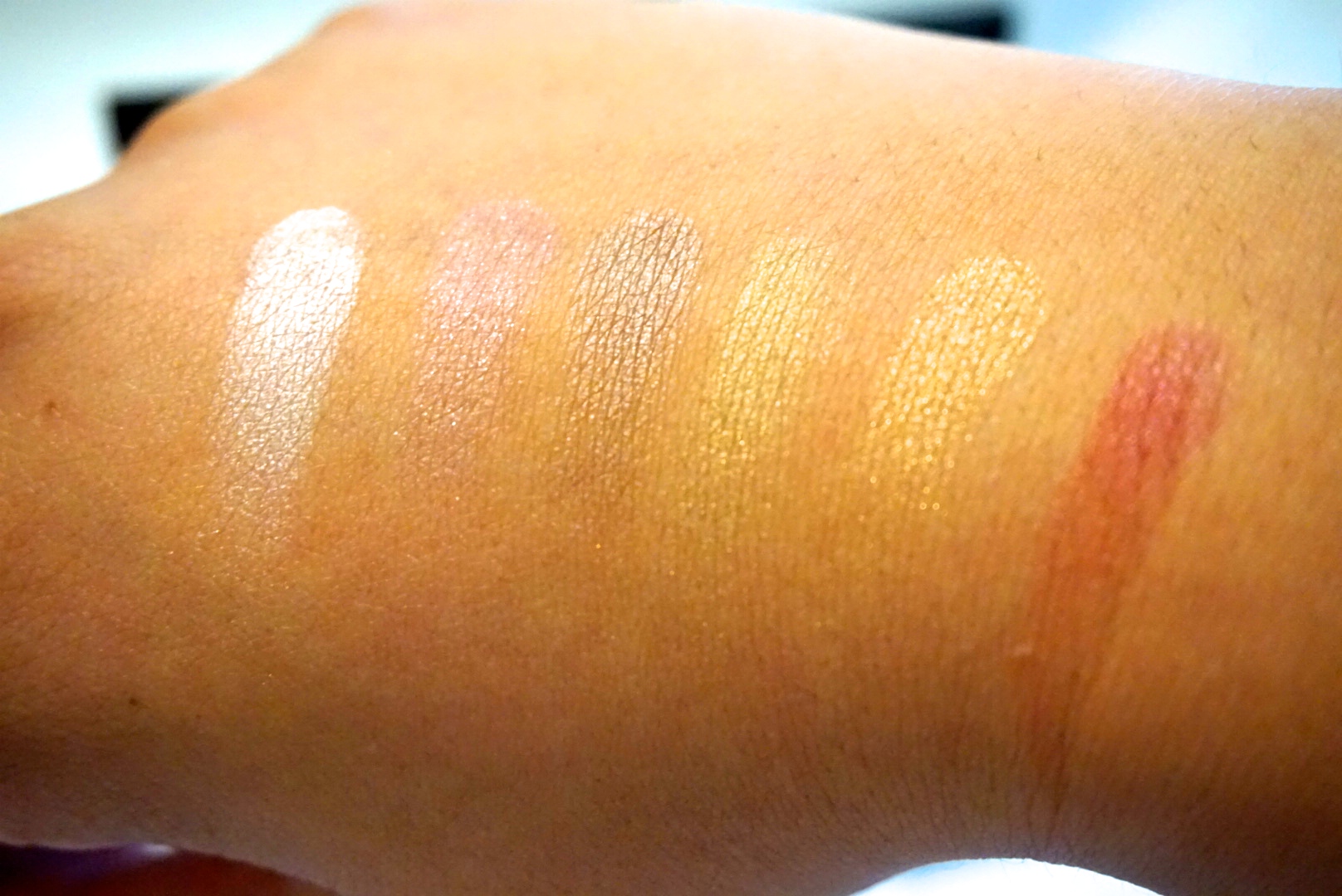
White (1st Top Row)
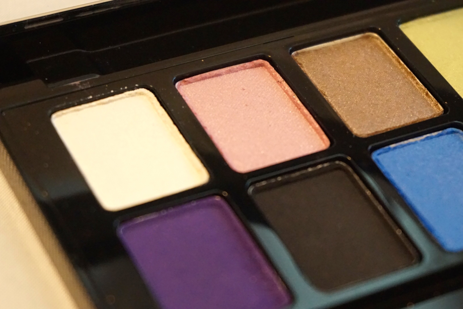
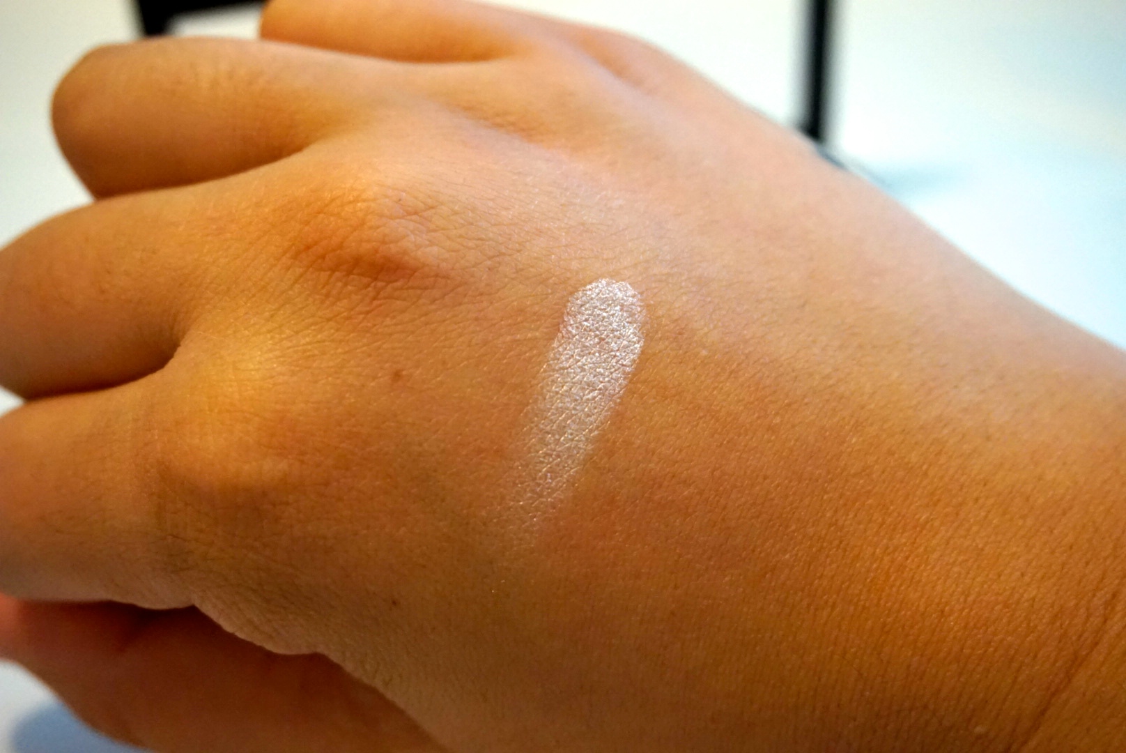
I adore this white! This is by fair the most pigmented color in the palette, which is awesome since most drug store whites are nothing to write home about. Defiantly a easy go to for inner highlighting.
Pink (2nd top row)
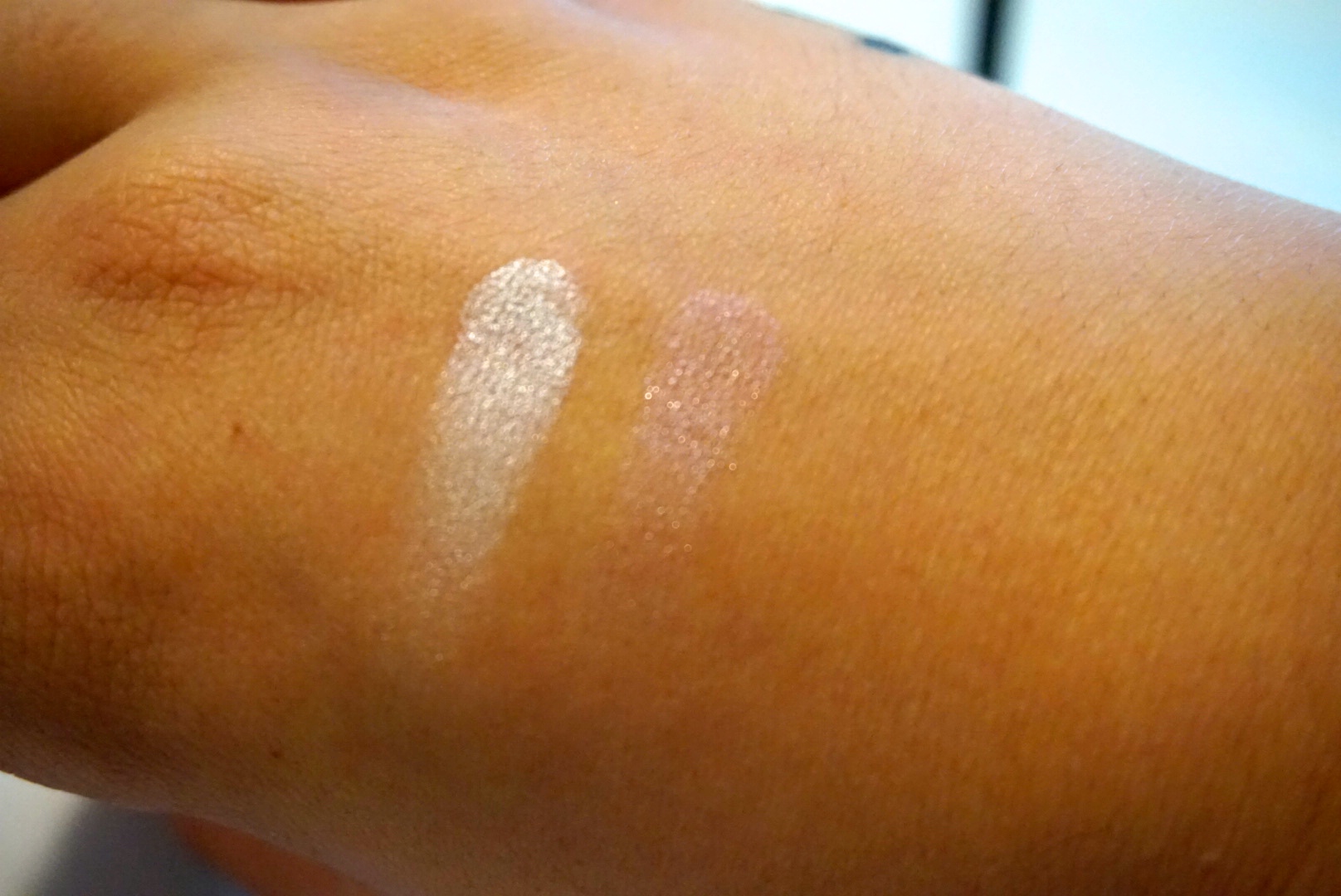
This pink is very very sheer. This pigment reminds me of Urban Decays Dust, however it is not as pigmented. This color would be lovely as a high light or layered over a darker pigment.
Taupe (3rd Top Row)
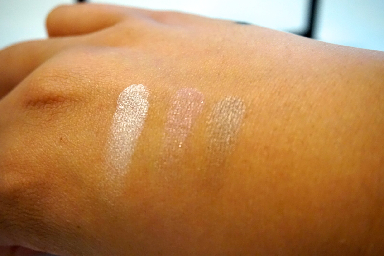
Once again this is another very sheer color. However I really enjoy this sheer brown. I feel like this is such a pretty color for those days that I don’t really want to wear a ton of shadow.
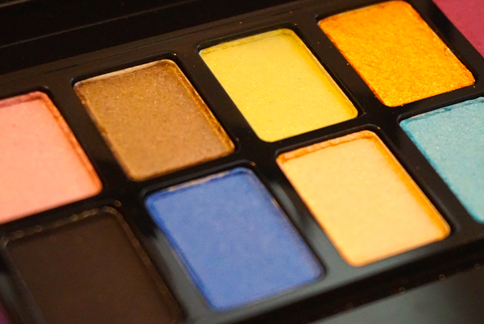
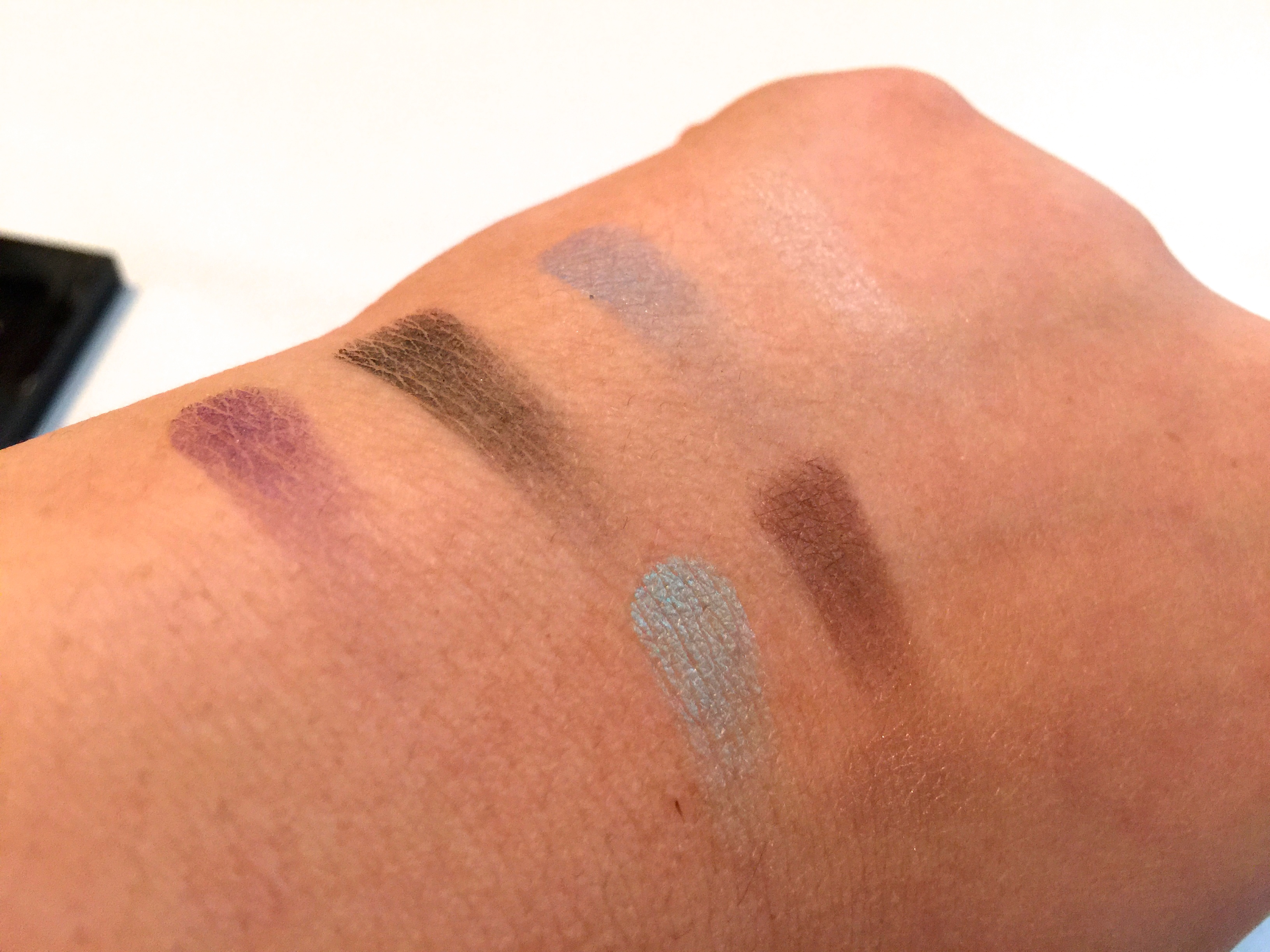
Green (4th Top Row)
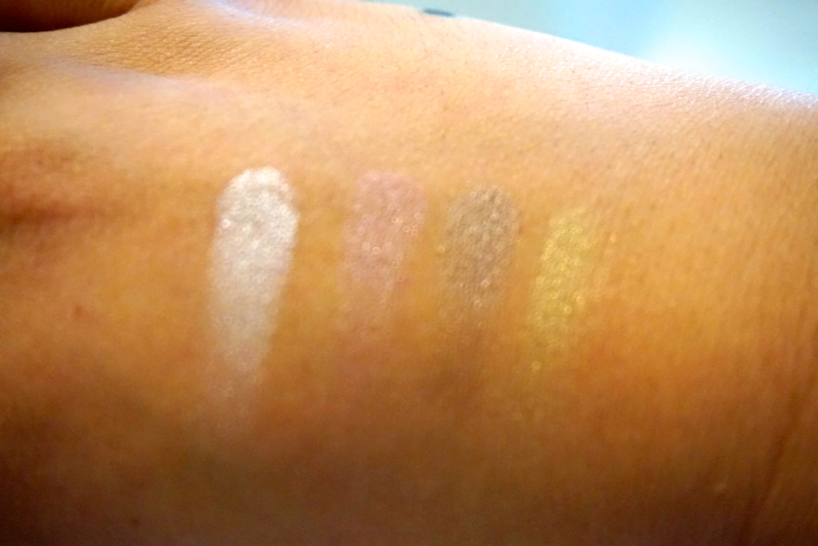
Not the biggest fan of this green. It’s sheer and easy to build, however I feel like this is one of those off-colors that you only use on green oriented holidays…like Saint Patty’s Day.
Gold (5th Top Row)
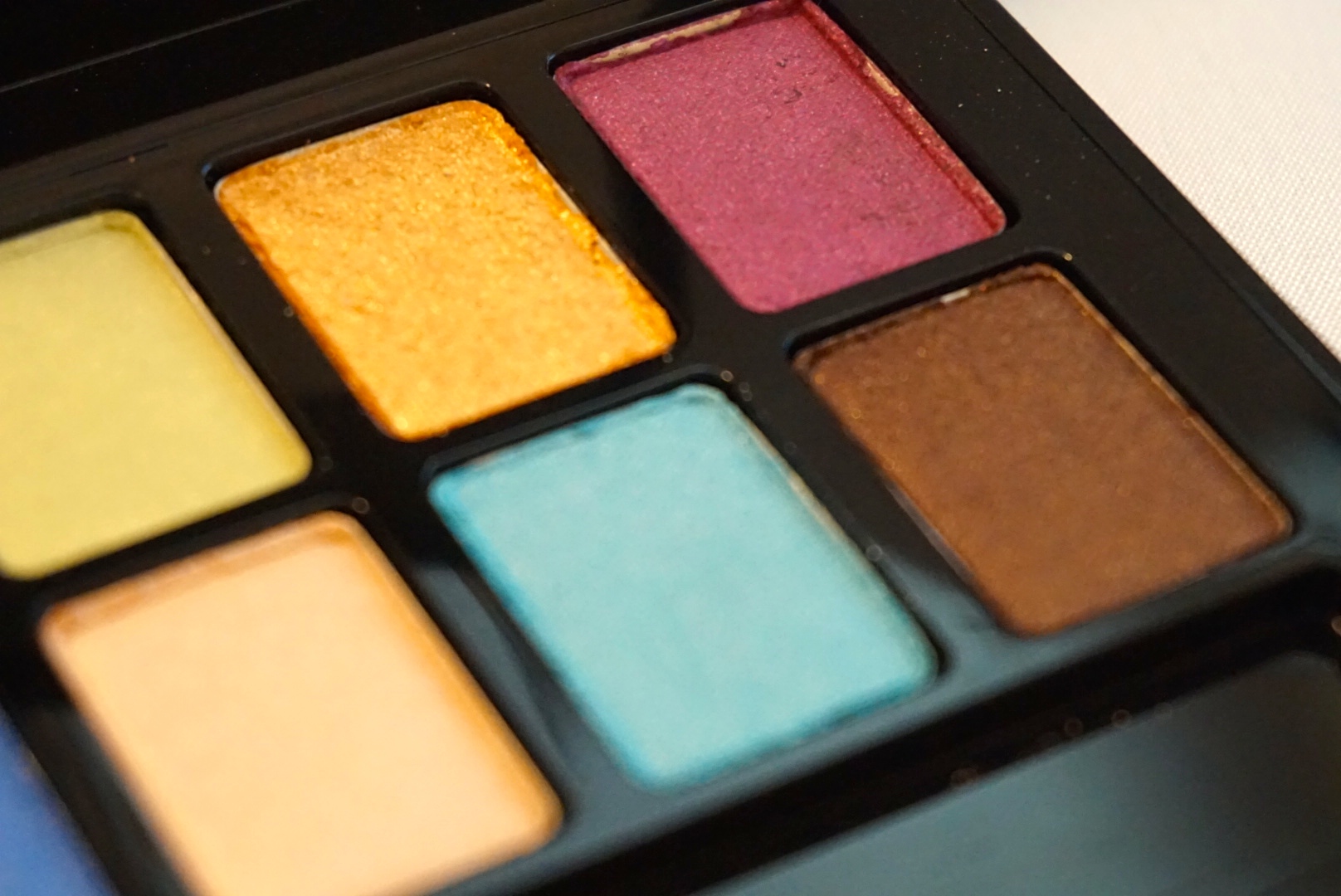
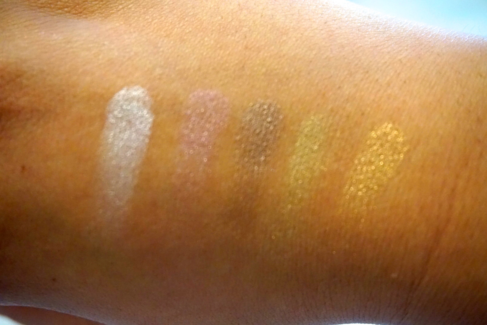
I’m a sucker for golds….I just can’t help it. So I automatically love this pigment. Just so pretty && simple.
Magenta (6th Top Row)
I like this color, however because it’s so sheer and not easy to build, I feel like I won’t get much use out of this shadow. (&& I know this is drug store, but I still like bang for my buck)
Purple(1st Bottom Row)
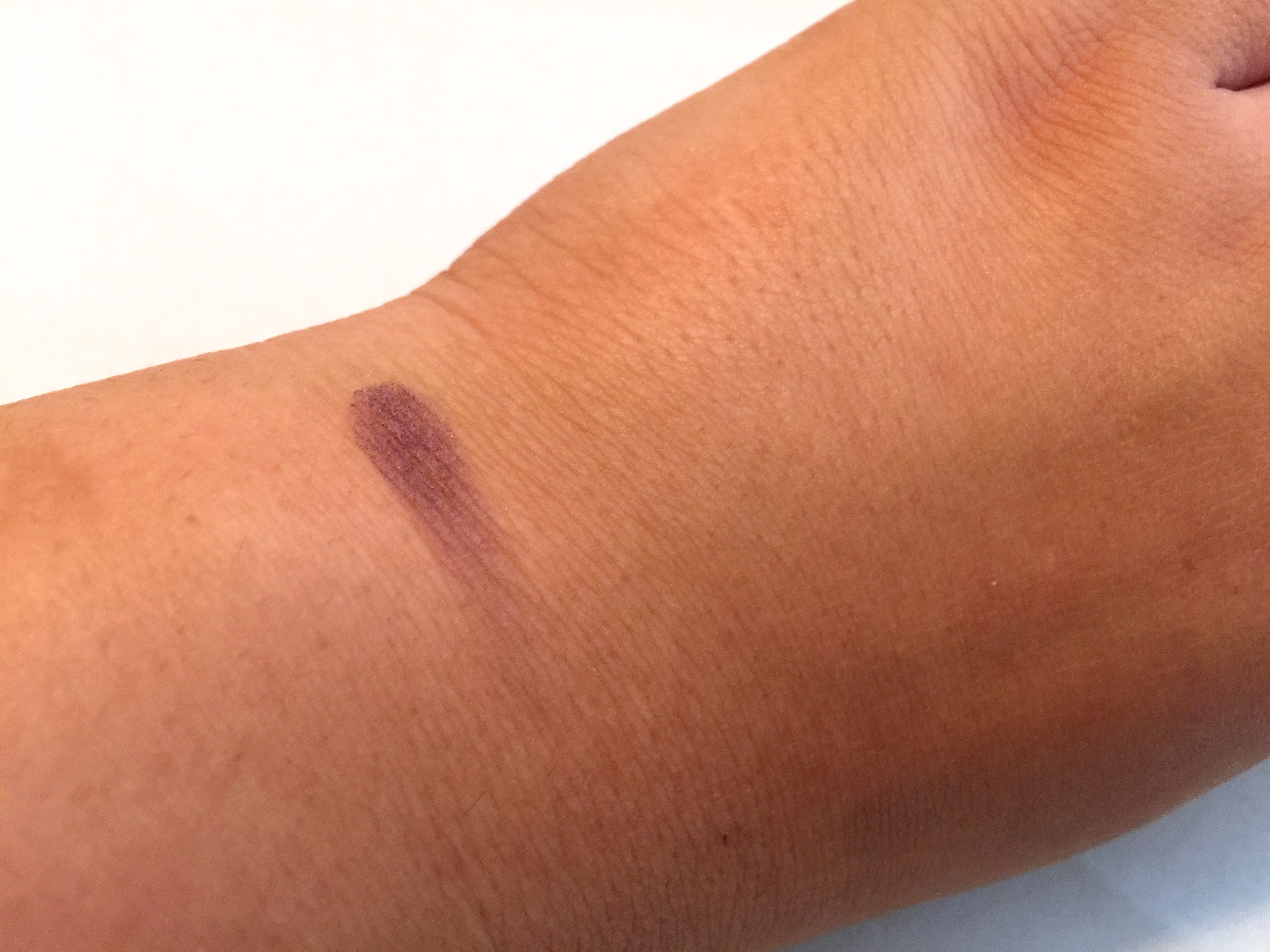
Love. Love. Love. Such a pretty purple. && I am not one to use purple shadows very often. This color in particular is very creamy, making easy to build. However, I am worried that this shadow won’t last all day. hmm
Black (2nd Bottom Row)
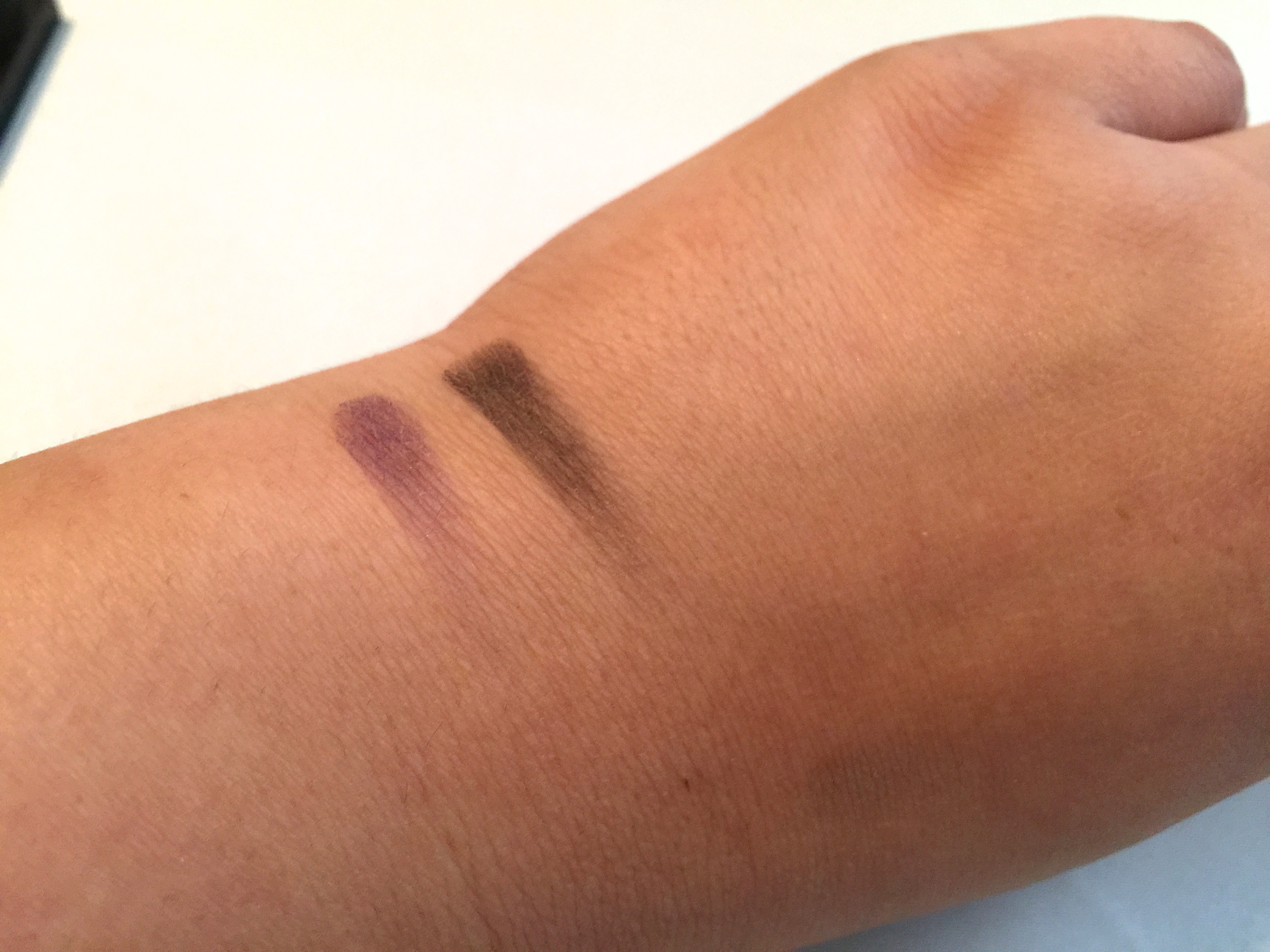
“I like my black as dark as my soul”
haha, couldn’t help it, had to toss that in. On the semi-serious note, this black shadow is rubbish. Give me a MAC or Urban any day.
Royal Blue (3rd Bottom Row)
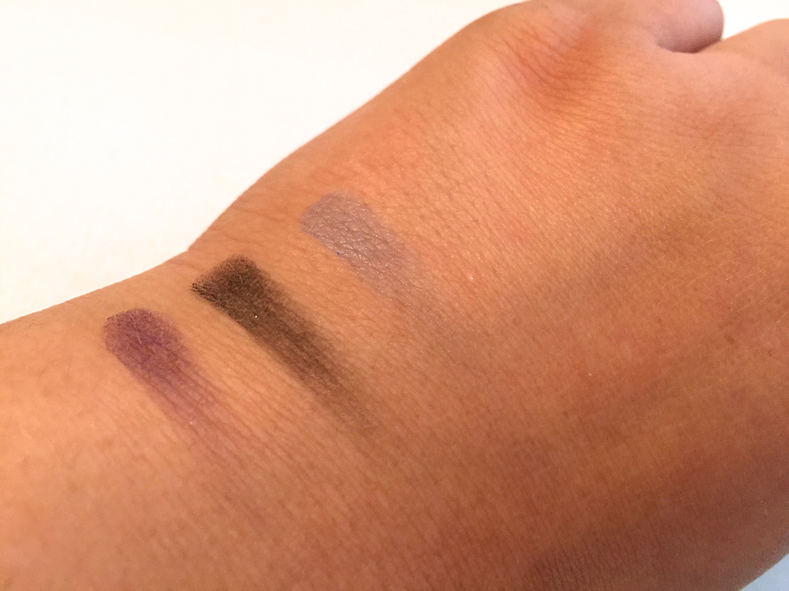
I want to like this color. But once again it’s so sheer I feel as though I would only use this for an under eye accent or as a crease blender.
Cream (4th Bottom Row)
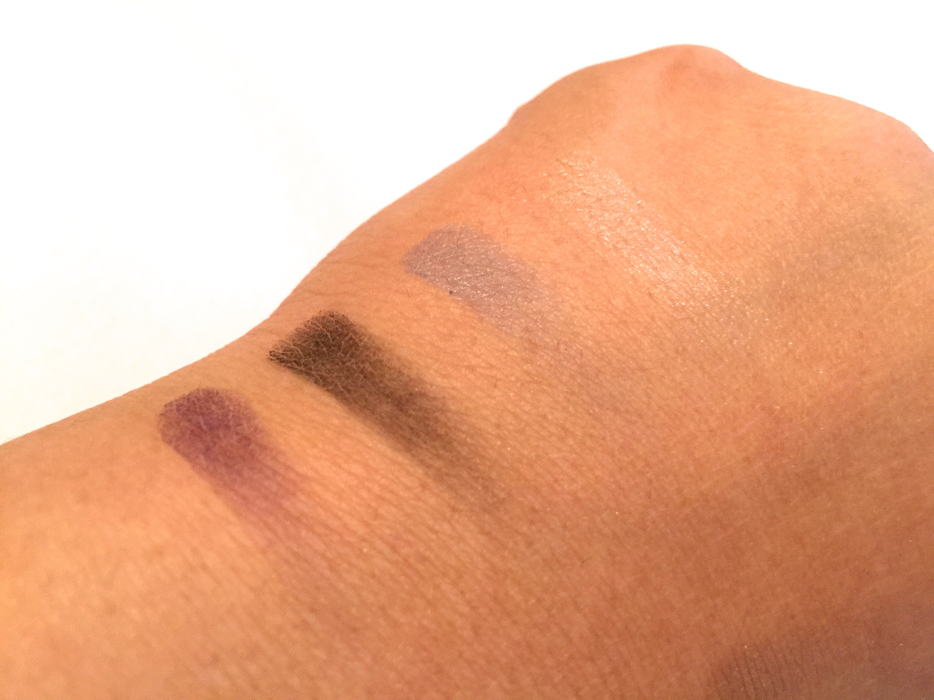
Eh, Eh. Eh. That’s really all I can about this cream color. I adored the creams in the Nudes palette, however this is so sheer, I think I’ll just stick with the Nudes for my drug store cream needs.
Sea Foam (5th Bottom Row)
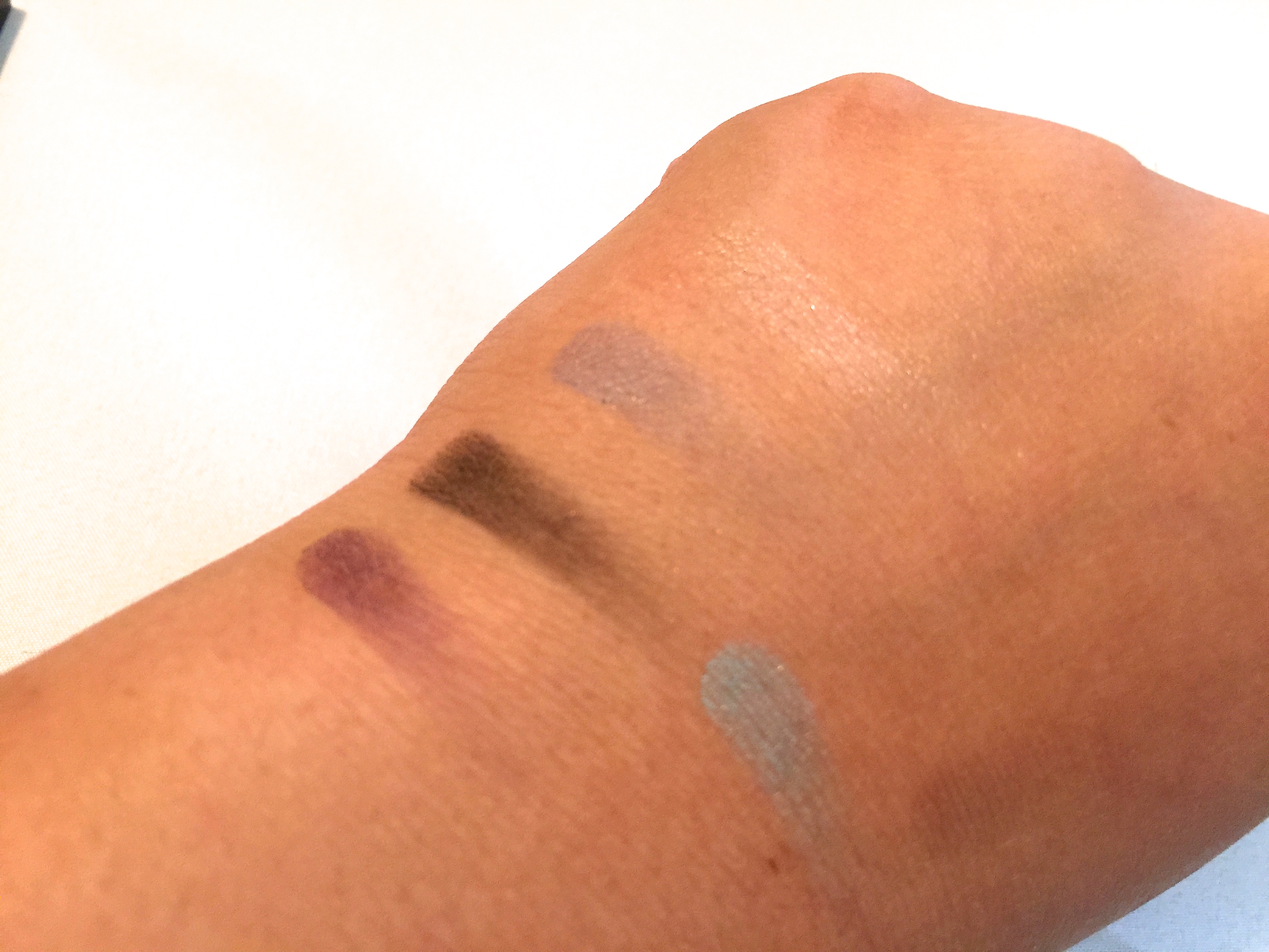
Unlike the royal blue, this color is so creamy && pigmented and lovely. I defiantly think I will get some use out of this color. (Especially for those days I want light pops of color)
Brown (6th Bottom Row)
This color is creamer, however it’s kind of an off brown for me…I’m not sure If I like this color or not. I defiantly need to wear this shaow around the town to get a better feel for it.
**
Over all this Palette I think is a nice addition to have if you enjoy using the colors from other bright color palettes such as Urban Decays Electric Palette. These would be useful for softening a bright look, or blending more pigmented colors out.
Over all however, I am not in love with this palette. My heart still adores the Nudes! haha
Well ladies && Gents thats all for now!
❤
Kisses

Wow I didn’t know they had a brights palette! I’ll have to check it out ☺! I love bright colors 😘
Pingback: March 2015 Favorites | MissVictoriaNichole